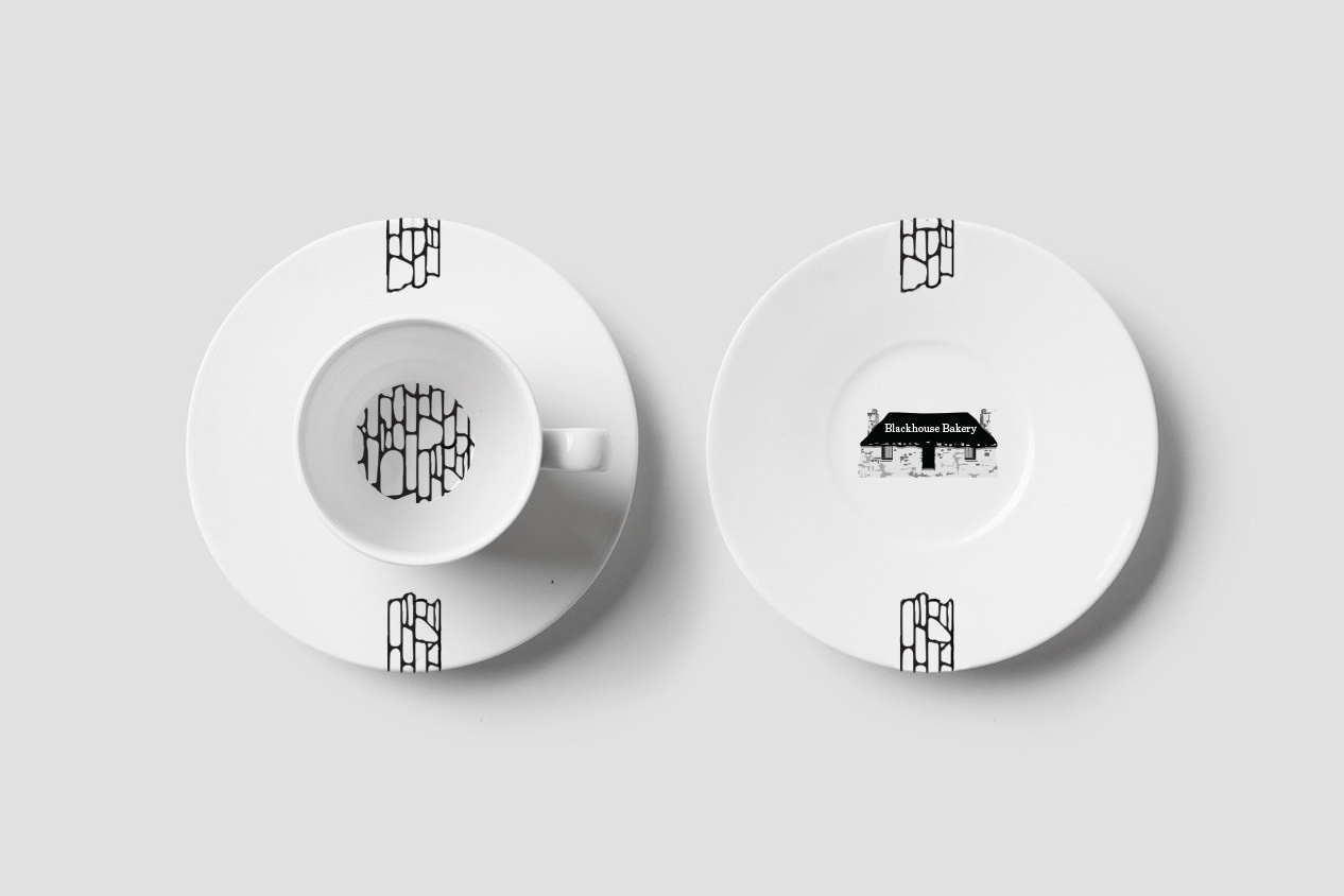
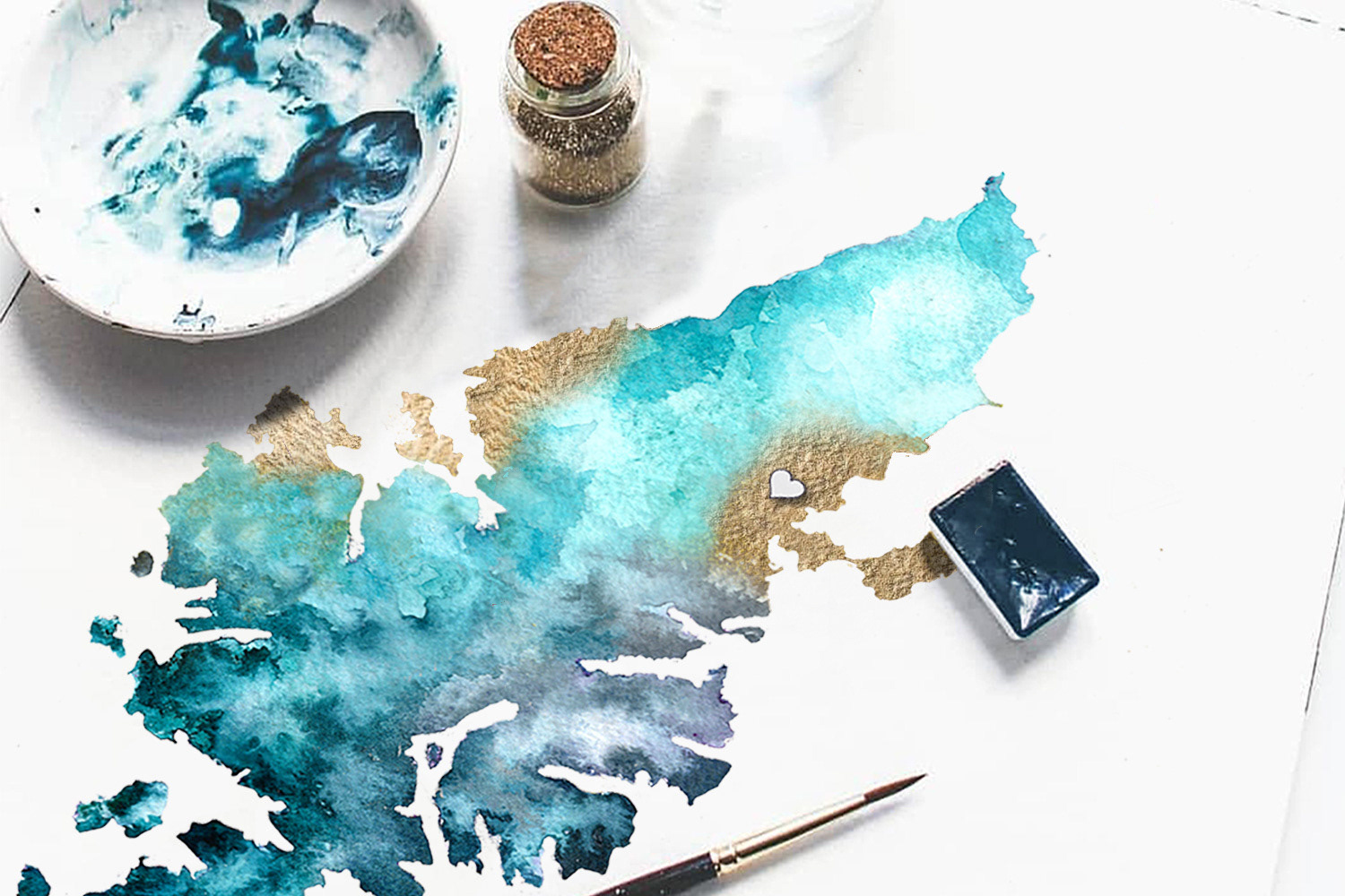
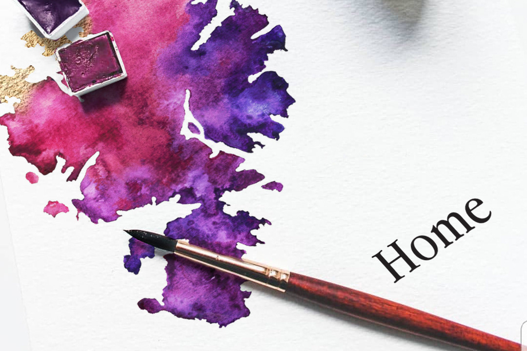
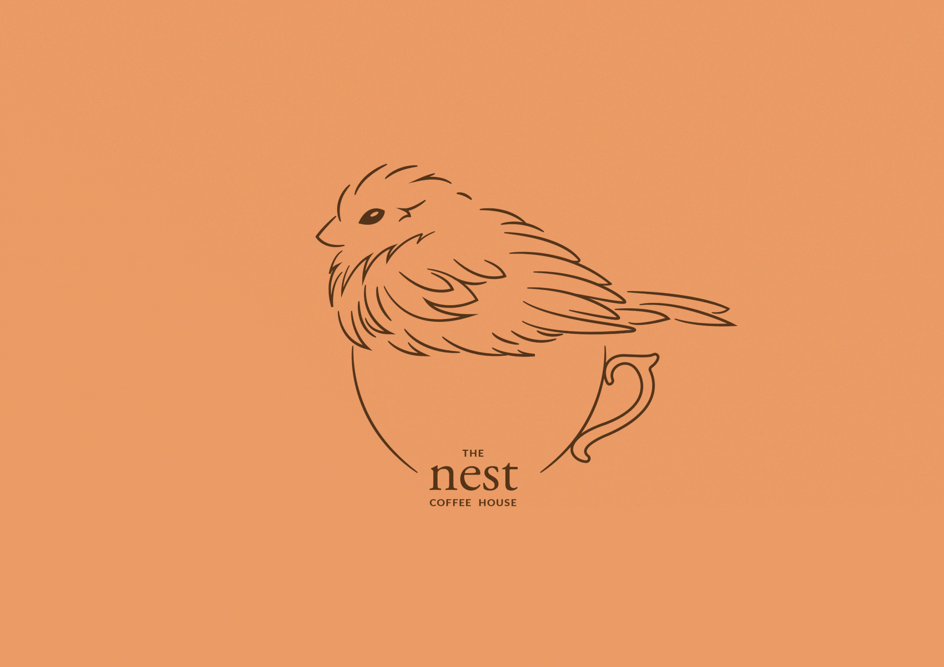
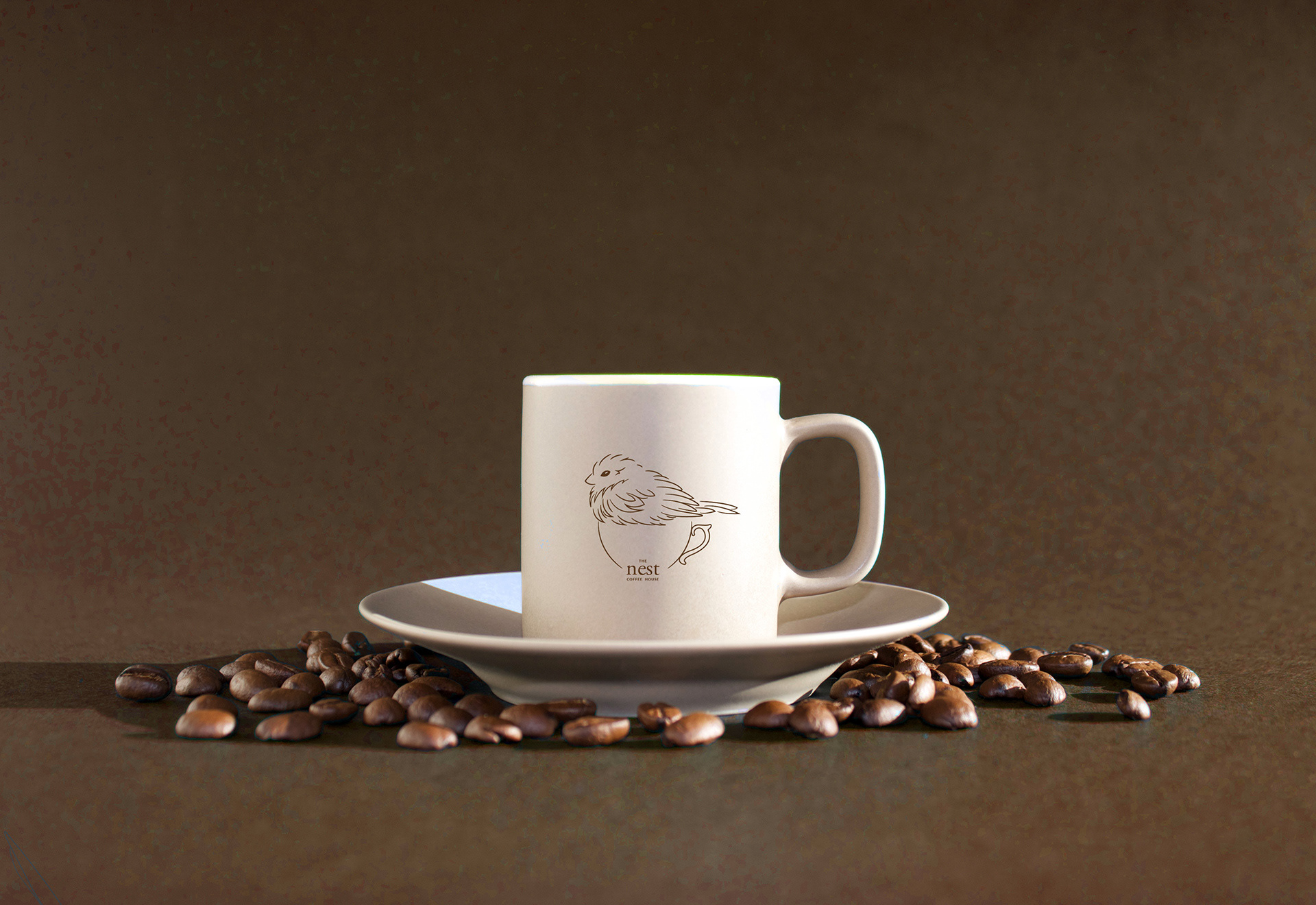
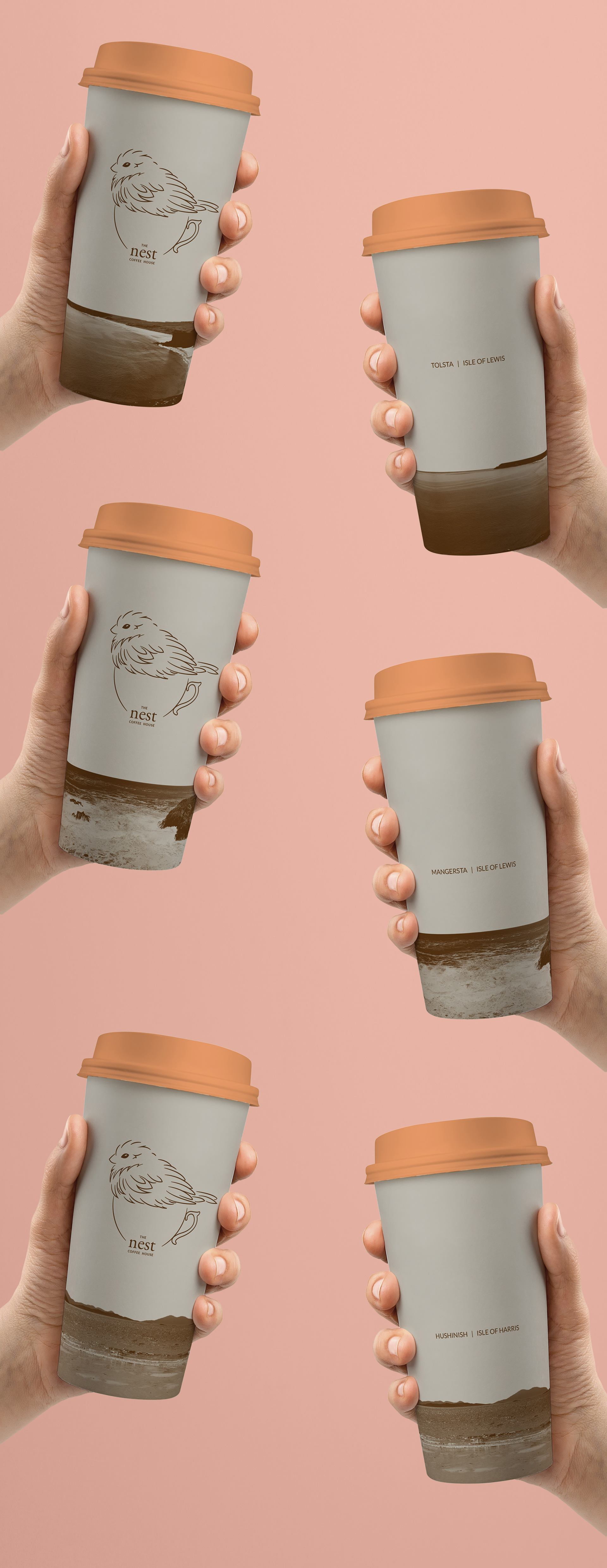
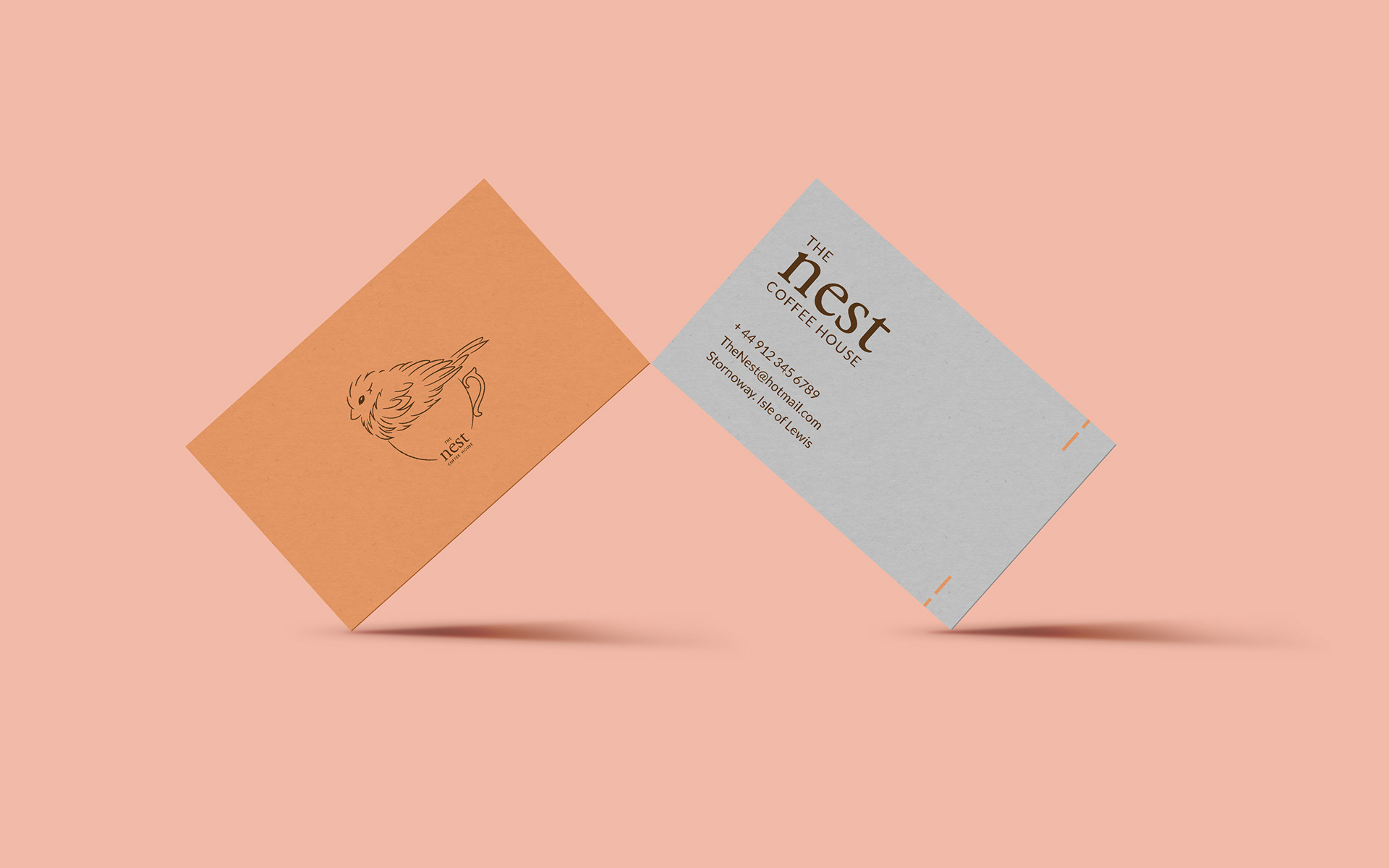
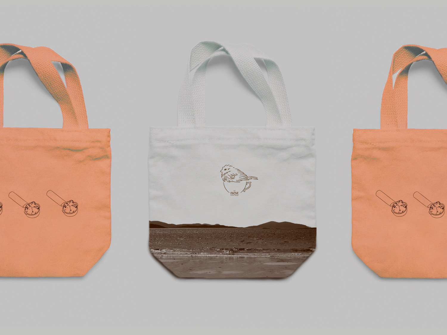
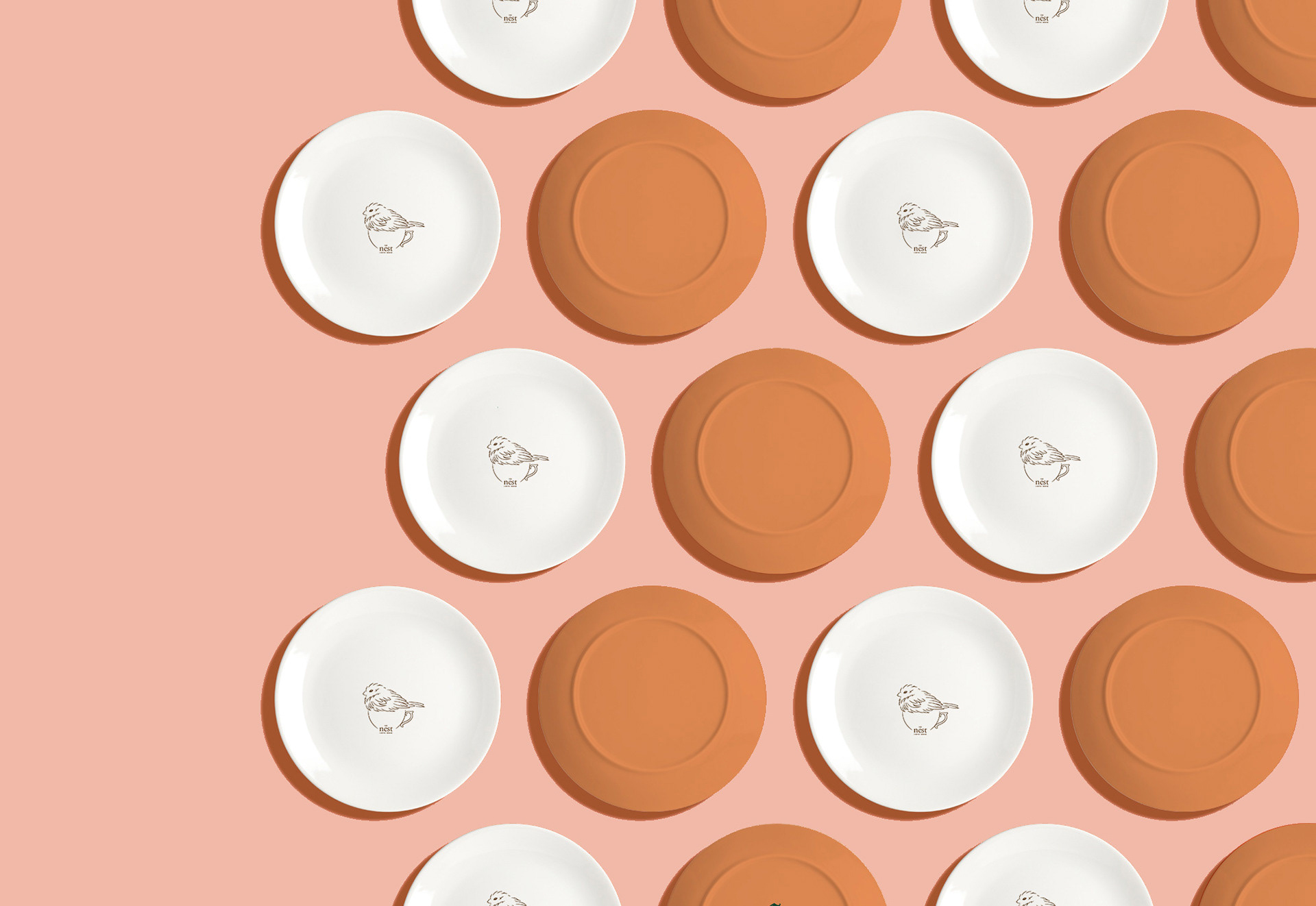
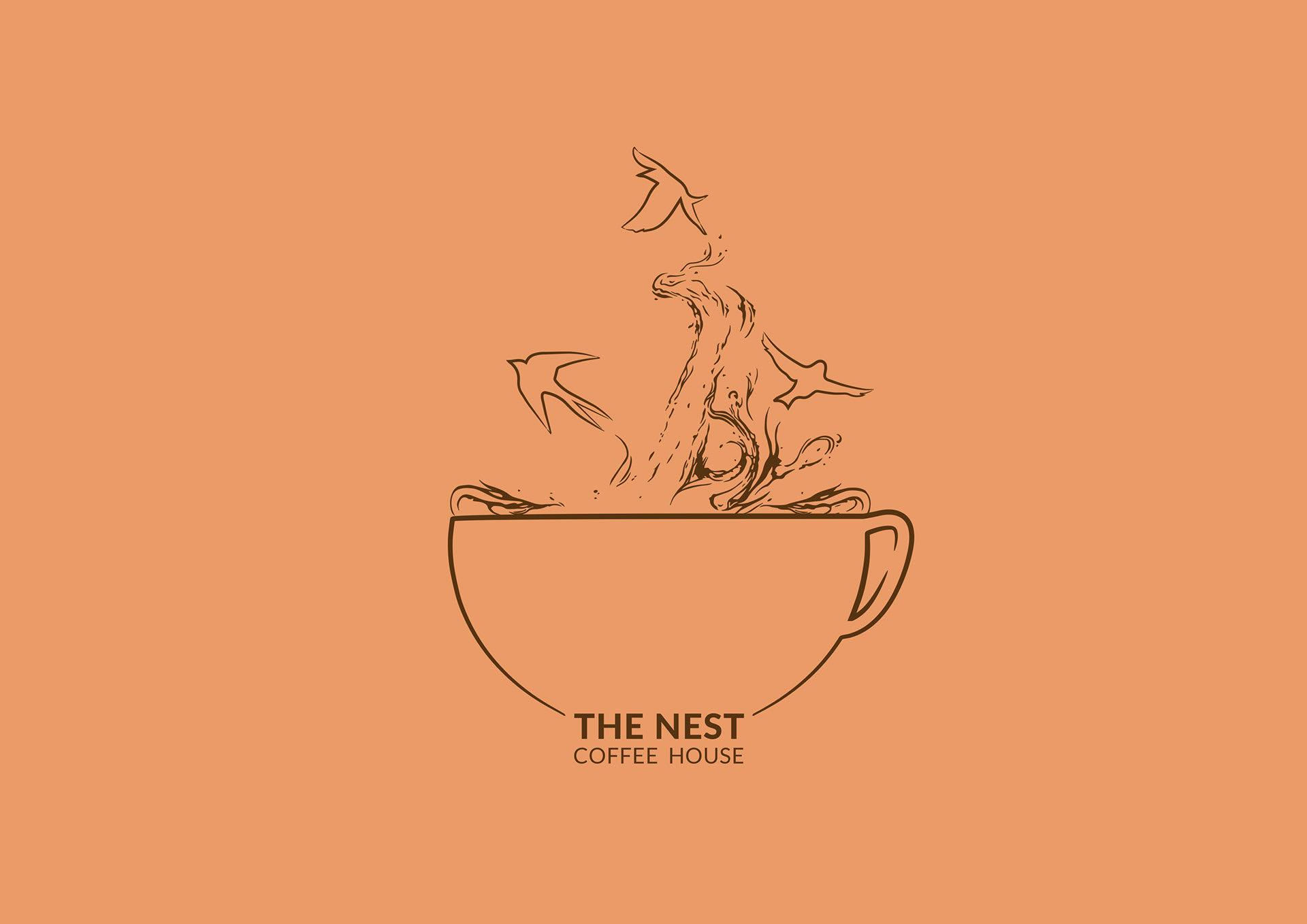
Brief - Branding for a cafe in the heart of Stornoway
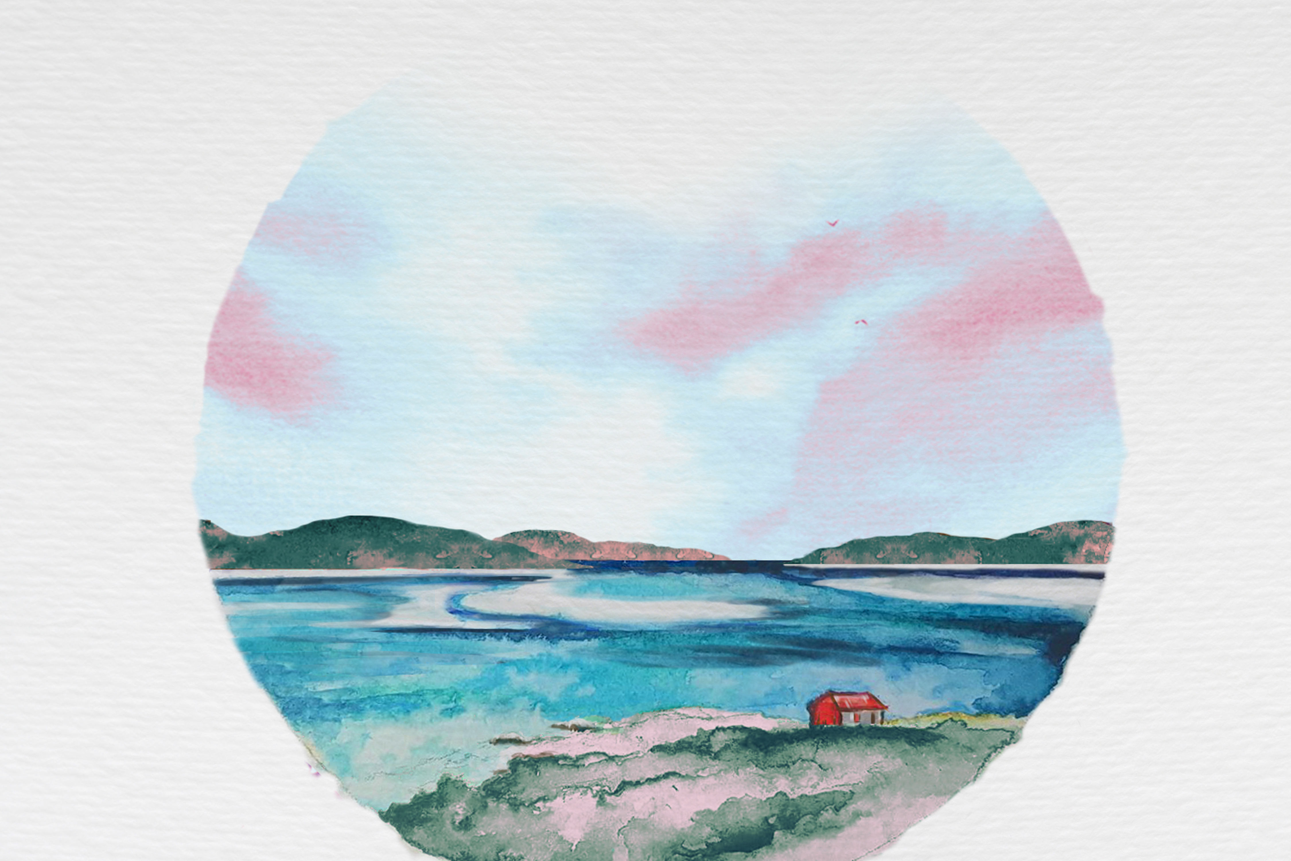
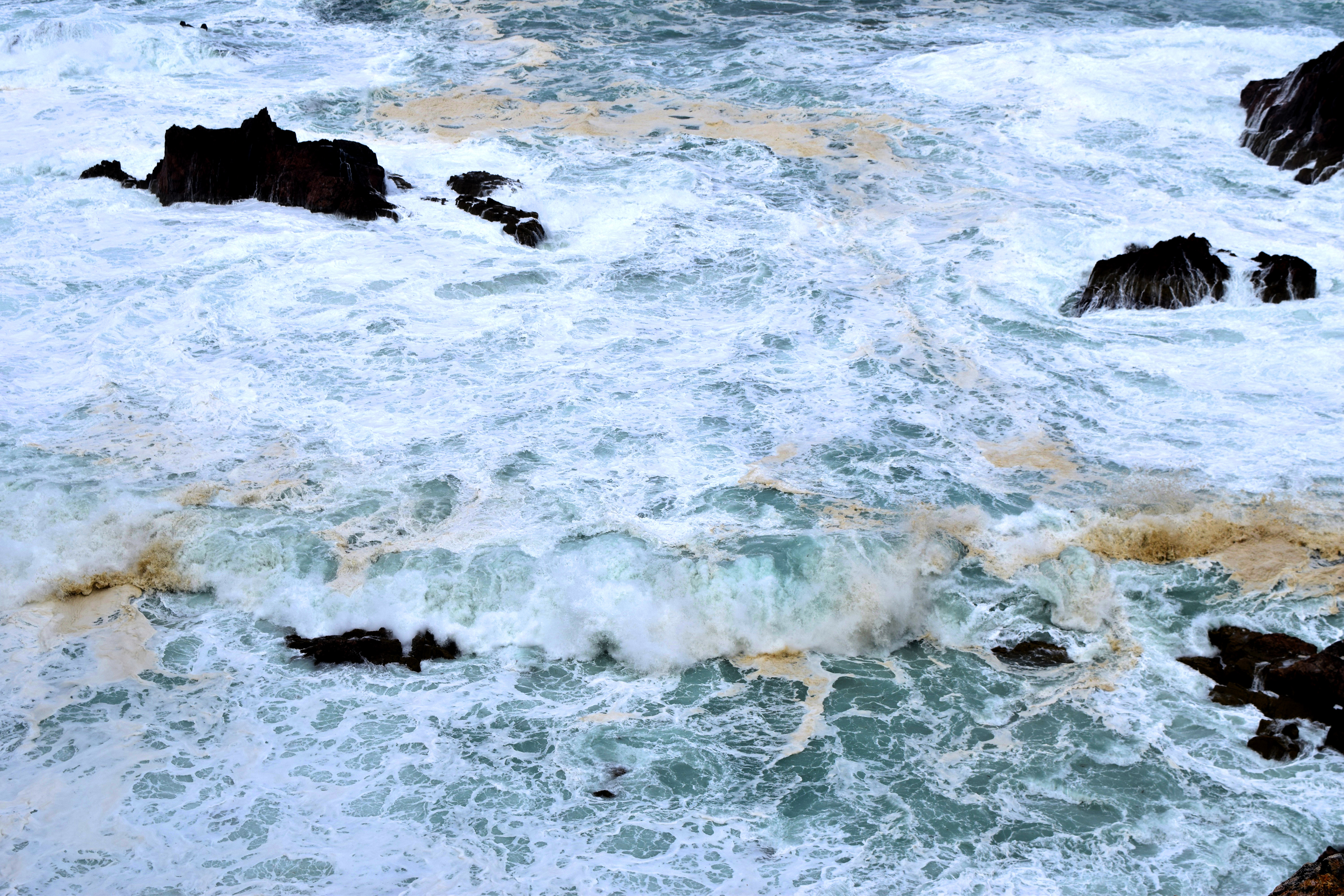
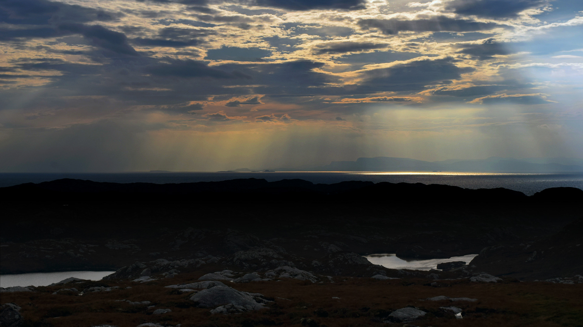
Conclusion - It was important that the islands landscape was recognisable in the colour palette without being too dull. Although beautiful, the Hebridean weather can get to us all and be slightly depressing. My solution was to choose a warmer, vibrant orange to accompany the brown, along with fun illustrations.

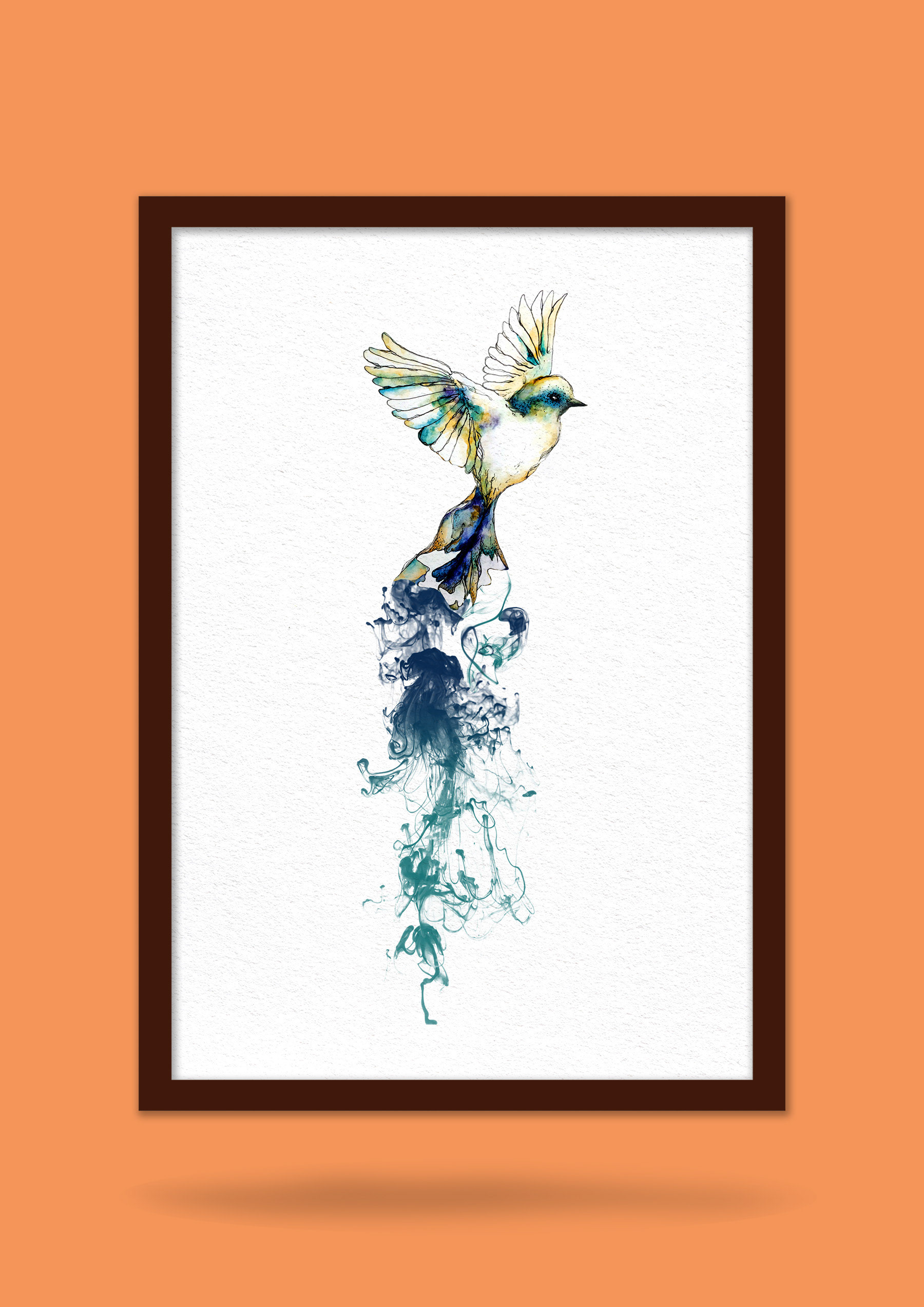
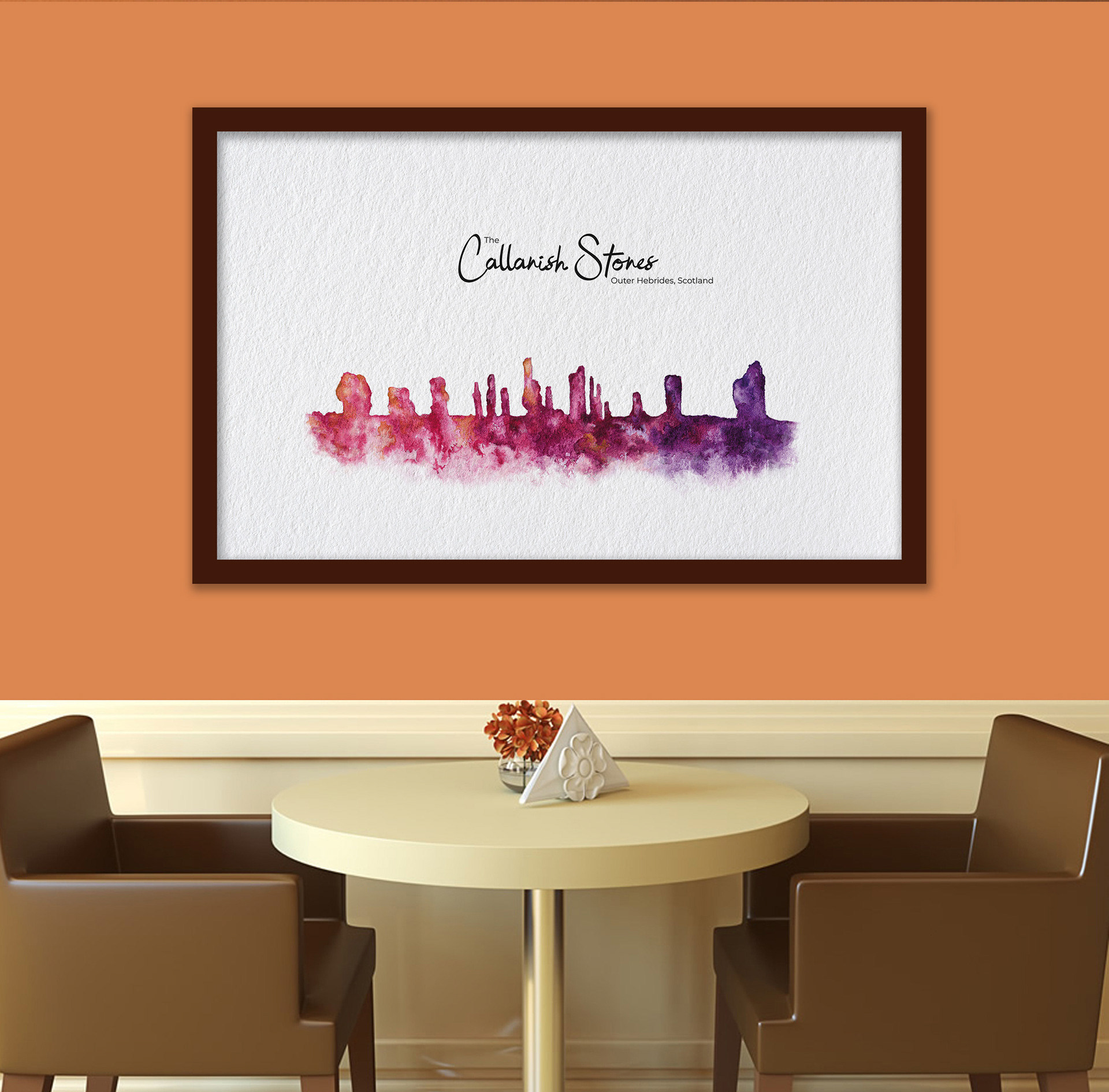
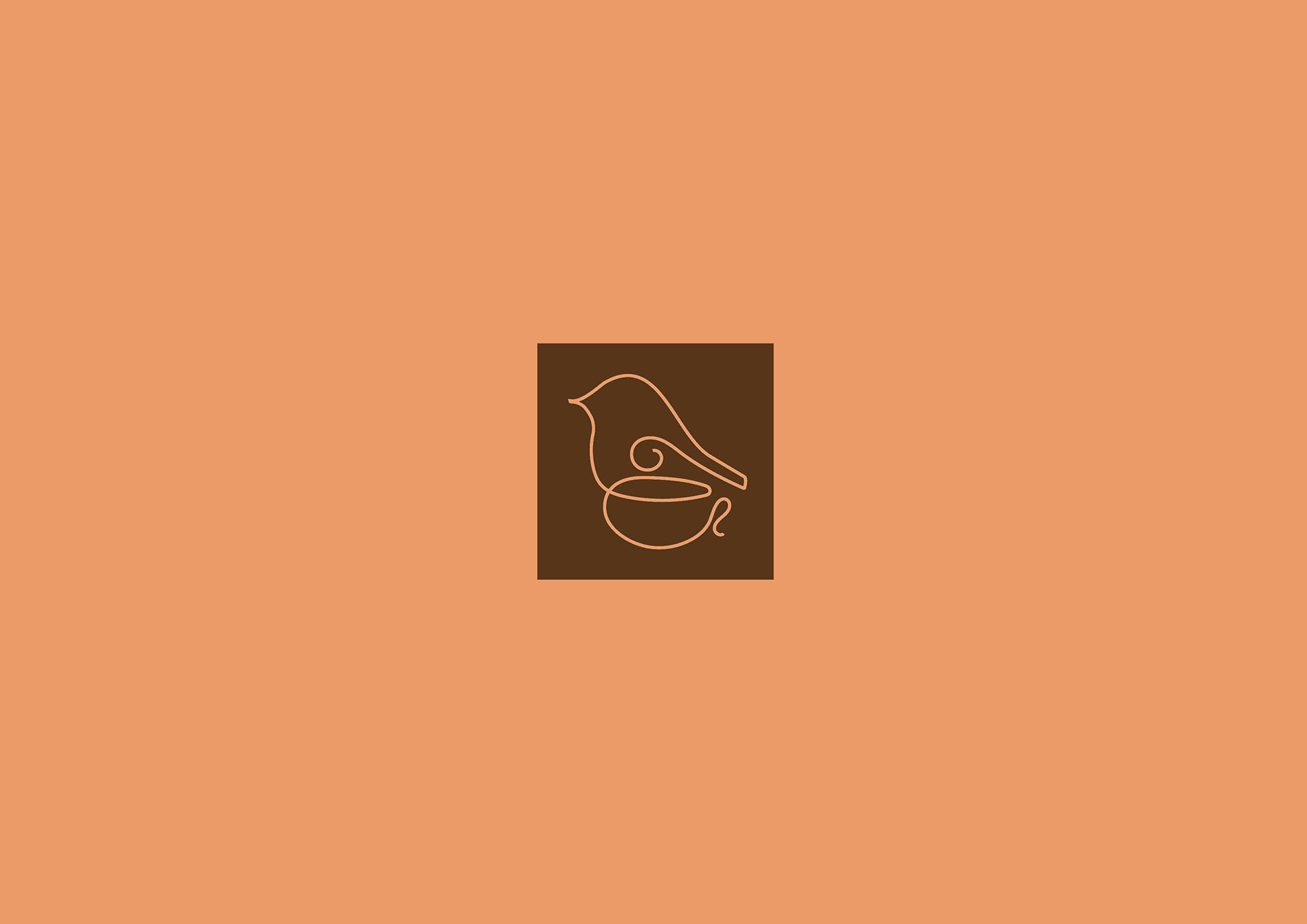
ALTERNATIVE LOGOS
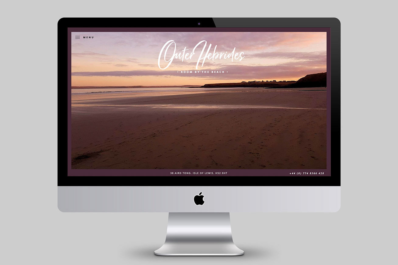
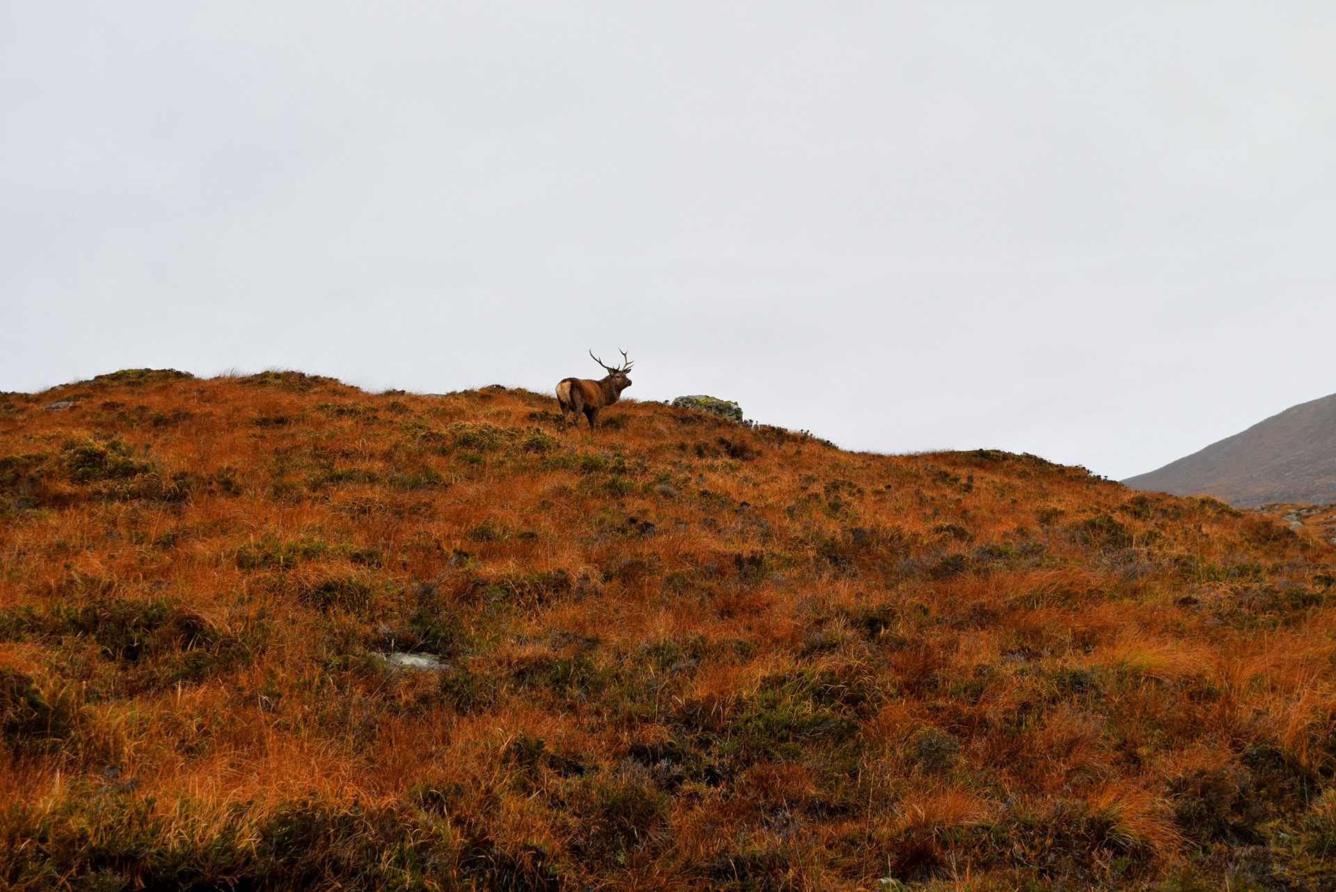
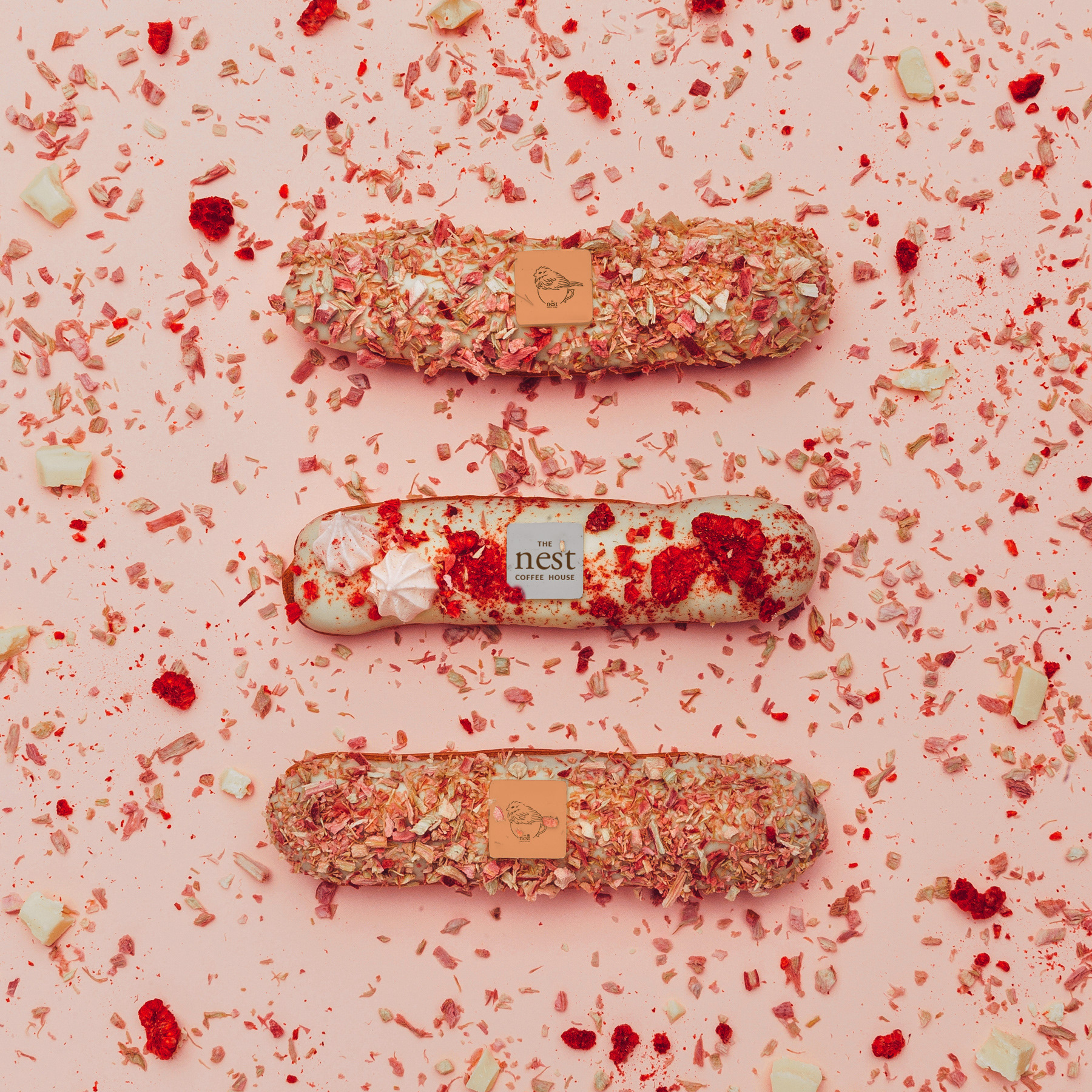
All photos personally taken.